“Shonky” means poor or low quality where I come from. I realised it was a Kiwi phrase, or at least Antipodean, when I told my current UK based team to “give me a shonky user interface (UI)”. They looked puzzled, then laughed, then asked me what I meant, then laughed again, then adopted the phrase into the team vocabulary.
Aside from the entertaining aspect of my request, it does raise two questions:
- What is a Shonky UI?
- Why on earth would anybody ask for a Shonky UI?
I’ll start with why.
How a Shonky UI can help
The team was in the process of mobilising. I had some project managers, business analysts, back end developers and infrastructure engineers. I had no testers, although I was going to borrow some, and there were no user experience designers or front end developers in sight.
Despite the fact we didn’t have the full team and some roles were missing we still had a lot to put together and/or explore. I wanted a pipeline to live but we didn’t even have a development environment. I wanted a complete development stack but we weren’t sure how we’d get a request from user interface, through the server to the database and back. And we weren’t sure which flavour of cloud solution we should opt for. I wanted a way to build and release our solution. I wanted to practice the way the technical team interacted with the business. I wanted to keep momentum as the rest of the team came on board. I wanted to demonstrate progress to key stakeholders.
And I absolutely did not want the development team to stall on the grounds that “we don’t know what the UX will be”.
So, while we were looking for a User Experience (UX) team, I told the business analysts and developers to “give me a shonky UI”. The reality was that although we had user stories to define the development spikes the detail of the user interface was irrelevant to my development objectives. Saying “shonky” was my way of making that clear. “Shonky” was, in our context, actually good. I told the team “give me shonky” and repeated it often.
In time we found and hired a strong UX team. In time they got their head around the application and started putting together UX designs. At that point we refactored the UI and shonky became history.
But by then we’d learnt a lot. We’d got the business engaged in the development process, built some environments, fleshed out the software architecture from UI to DB and back, had a build and deployment mechanism, and demonstrated progress.
What a Shonky UI looks like
What does a shonky UI look like? Hand drawn wire frames, CRUD operations, and no gloss. The BAs knocked up the wire frames and pinned them to the user story cards. They weren’t on the back of a envelop but they could have been.
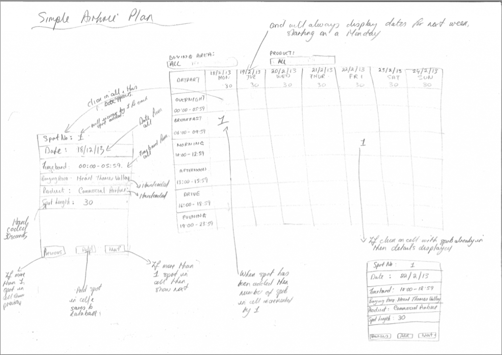
Hand Drawn Wireframe
No gloss. No css. No semantic markup. Just the bare bones UI to fulfil the user story.
I wanted to prove the development stack and the CRUD (Create, Read, Update, Delete) operations help do that, rather than anything that just involves the UI.