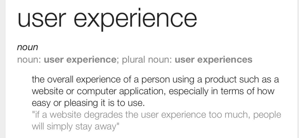
Obvious, right. Well, perhaps not. After all, what is UX anyway? I have many conversations on this topic, with developers and UX designers, and I never seem to get the same answers. I find that both fascinating, and a little frustrating, and I’m very aware that the feeling’s mutual! I have a simplistic view on this, fortunately for me it aligns with the definition that pops up when you Google (other search engines are available) “what is ux”.
My frustration is simply this, and I’ll give you an excerpt from a conversation that resulted in toys being thrown from an incredibly talented pram;
“You mentioned in your presentation that you have introduced improved, innovative and intuitive UX. That’s awesome, well done”
“Thanks”
“Can I include some of your research in the presentation, put some meat on the bones”
“Er, what? What research are you on about?”
“Well, what evidence is there that your design is improved, innovative and intuitive? You must have talked to users to quantify that?”
“Users, what users? What’s the point, I know what they want, they don’t really get it. I’m great at UX, what do you or they know about it that I don’t?”
I think you get the picture, we agreed to disagree. I was late to join this team, and the wheels of the development machine were already turning at a rapid rate. That was a good thing, fortunately there’s always time to make adjustments, after all we weren’t due to go live for at least a couple of months.
Time to fly in the the UX peeps! I try and keep a flexible UX resource or two up my sleeve for times like this. Or depending on the size of the problem, dive in myself. So what did we do?
- We ran recorded, task-focussed feedback sessions. This was an eye opener, apparently the old system was more intuitive, but that could’ve been a familiarity thing.
- We captured valuable feedback about how to de-clutter the UI, surface the real useful actions so that they’re in your face, and obvious. This was a very quick thing to fix, we had a very capable UI developer.
- The next week (we only did UX one day a week), we put the folks in front of an updated UI. Much better, now the experience was simplified, they could start to think about features that would actually add value and save them time.
- We iterated on this a few times, each time responding to input from the teams who used the system, and each time making subtle tweaks to both the IA and the UI layout. We did receive the obligatory requirements reserved for a rainy day and a limitless budget, but we handled those pragmatically and focussed on the main.
The end result was superb, and with a truly user-driven approach we had actually achieved a UI that was improved, innovative and intuitive in about 3 iterations. We eventually presented this to the Product Owner, backed up with little video clips showing the guys using the system and their noticeable pleasure whilst doing so, we were even lucky enough to be given lists of why they “loved” the new system, which featured in the programme board meeting.
That’s my view of how UX can really add value! Ideally with low cost prototype exploration from the start, as opposed to a re-write later in the day, but the process is simple, repeatable, measurable and informative. It’s also very quick to do with the right resources to hand, and shouldn’t be perceived as an indulgence reserved only for massive projects with huge UX&D budgets. A little extra involvement goes a long way.
About Rich
Rich Lewis has worked in software delivery for 20 years. He first discovered Agile practices in 2004 and moved to Kanban in 2012. Rich knows how to balance productivity and fun, and is no stranger to leading teams through difficult challenges.
This post was originally published on Rich’s blog Small and Swift.
