Gojko Adzic has recently published a great book on a technique he calls “Impact Mapping”. Gojko’s Impact Maps are a visualisation of the business drivers and the associated project scope. This means the people doing the work (developers, UX, testers, etc) know what to build but also why they are building the functionality, how the functionality fulfils the business outcome and and who the functionality is for. Love it.
As it happens Programme Managers already have a very similar tool for a similar purpose. Benefits Maps, like Impact Maps, are used to visualise business drivers and associated scope, in this case programme scope. They answer two key questions:
- Why are we doing the programme?
- How will we realise the benefits?
The dual function – showing why and how – make Benefits Map high value documents. It also means a Benefits Map can easily morph into the initial Programme Blueprint. For a simple programme the Benefits Map may be the only Blueprint. And the diagram format means it fits on one page. Even in a world where we value “Working software over comprehensive documentation” that one page is worth having.
Reading a Benefits Map
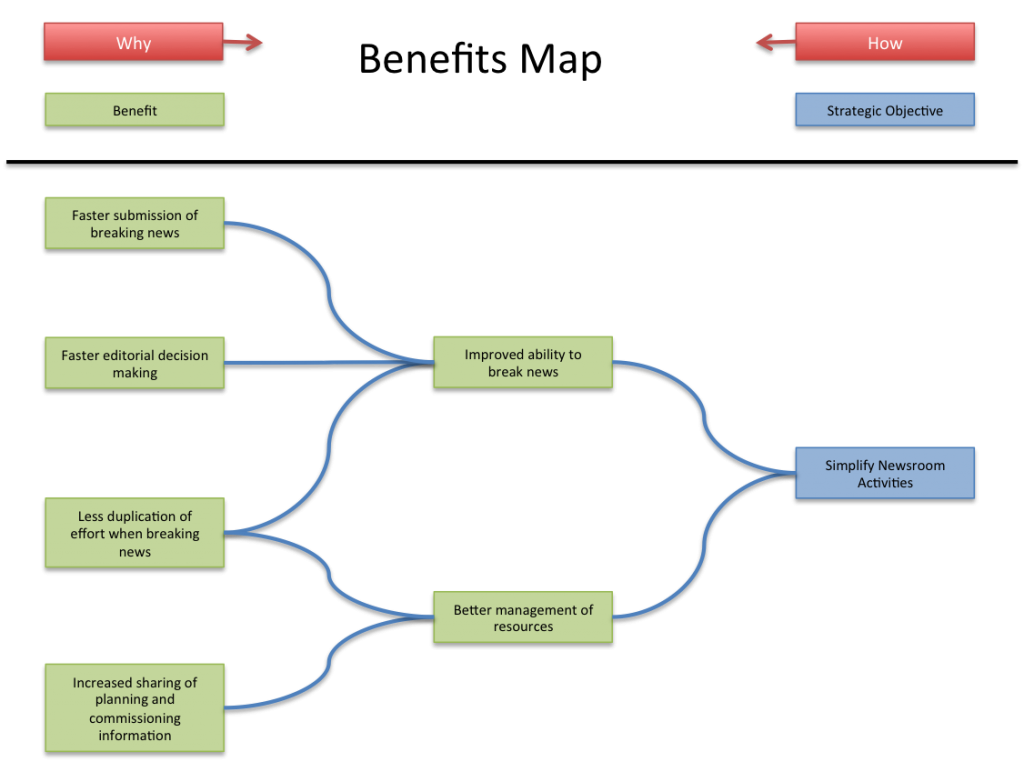
The diagram shows an example of a Benefits Map. Actually it is subset of a larger diagram but it illustrates the principles. The business domain is News and in this case a strategic objective for the organisation is to “Simplify Newsroom Activities”.
Going from left-to-right the Benefits Map shows “why” we are doing the programme of change (Thiry, 2010). The core of “why” are the benefits. Benefits are the measurable addition of value. Because they are about adding value, improving some aspect of corporate world, benefits need to include a comparative adjective, for example “Improved ability to break news”. Other possibilities are faster, better, more, greater, increased, fewer, less, reduced. Strategic objectives are, in a sense, a higher form of benefits so a Benefits Map shows these as well, at the extreme right hand side.
Going from right-to-left the Benefits Map shows “how” we are going to achieve those benefits (Thiry, 2010). Often benefits are themselves dependent on other benefits that have to be realised first. In the example map, the final benefit of “Better management of resources” depends on achieving two intermediate benefits first, “Less duplication of effort when breaking news” and “Increased sharing of planning and commissioning information”.
Benefits Dependency Map: The initial Programme Blueprint
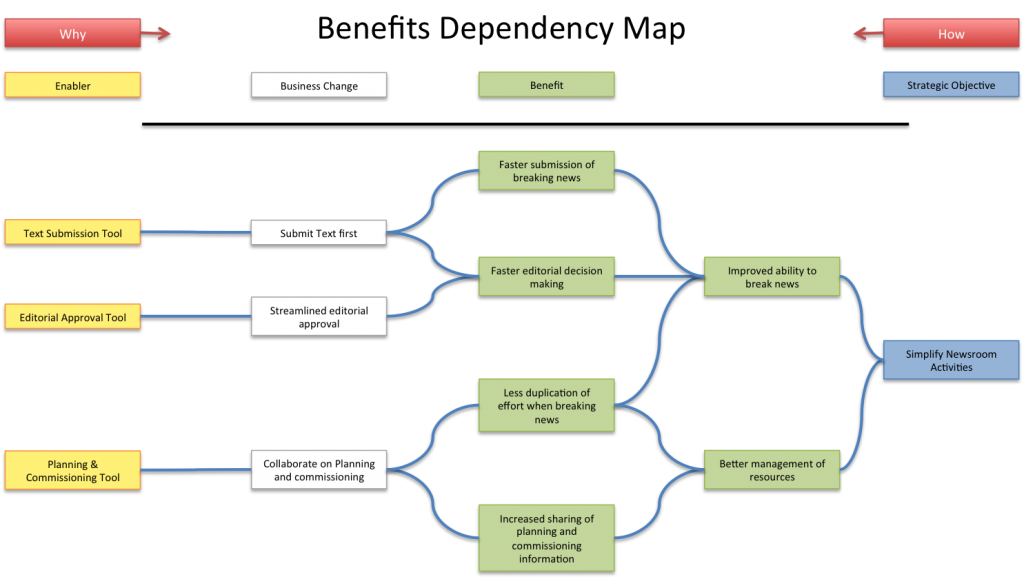
A Benefits Map can easily become the initial Programme Blueprint for change. The Blueprint is a model of the future business environment needed to achieve the vision. You morph a Benefits into a Blueprint by adding enablers and business changes to the diagram. For each benefit define the prerequisites that absolutely must happen if the benefit is to be realised. For the purpose of this post I’ll follow Bradley (2010) who calls this annotated version of the Benefits Map, with enablers and business change, a “Benefits Dependency Map”. In my day to day work I don’t bother making the distinction – they are all Benefits Maps to me.
The Benefits Dependency Map shows business change necessary to achieve the benefits. What we are talking about is, literally, changed behaviour by the people in the organisation. MSP calls each change an “Outcome” but I think “Business Change” is clearer.
Enablers are products. Something physical, tangible, even if electronic. An enabler might be purchased or created from scratch. Sometimes these are called “deliverables” but I prefer the term “enabler” as they have to support the business change. I can’t help wondering why we’d create a deliverable unless it enabled change. It is worth mentioning that in a programme context an enabler has no intrinsic value, whether complete or not. This is because it is the change the brings the value not the deliverable itself.
The Benefits Dependency Map makes priorities clearer and that helps planning. Those enablers and business change that lead to major benefits should be prioritised. The dependency aspect of the map will also make it clear where we have to get some prerequisites before we can deliver the real goal.
MSP style Benefits Maps show both Capability and Outcomes (the actual Business Change). This makes it quite explicit that capability is not the same as change. Capability might enable the desired outcome but the capability is only realised when behaviour changes (i.e. has an impact). That is all true but I find having both just clutters the map.
How to draw a Benefits Map
You plan from benefits to business change to enablers. In other words the programme starts with some idea of the organisation goal and the programme team attempts to plan out how to achieve that goal.
Typically the programme manager will rough out the first draft map. Mind maps are a great format for getting ideas down quickly. It is easy to go from a Mind Map to the left to right tree or network necessary for a Benefits Map.
The programme manager then refines the map in a workshop with significant stakeholders. The Sponsoring Group are the people who will want to input into the Benefits Map so are the ones to pull into the workshop.
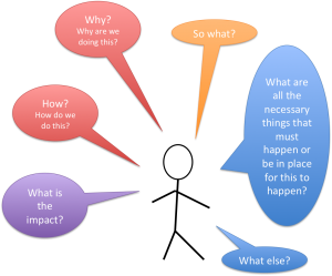
Finding the right benefits, business change and enablers to put on the map is all about asking questions. These questions let us test we’ve got the right boxes and the correct connections between boxes.
For each box on the map ask:
- Why are we doing this?
- What else – good or bad – will it lead to?
- So what?
- What is the impact? Effect?
- What causes this?
- How are we doing this?
- What are all the necessary things that must happen or be in place for this to happen?
Thiry (2010) uses how-why logic to flesh out out the diagram. For example, the answer to “How do we get Faster submission of breaking news?” is ensure the journalists “Submit Text first”. And for “Why do we want faster submission of breaking news” the answer is we want “Improved ability to break news”.
Patrick Mayfield recommends asking the simple question, “What else – good or bad – will it lead to?”. Again this is to identify items to the right, in the “Why” direction. Mayfield’s question also acknowledges that the result might be something bad, a disbenefit.
Both Patrick Mayfield and Thorp (1998) use “So what?” as a variant on “Why?”. For example, “So what if we have less duplication of effort when breaking news?”. If answer is, it gives us “Better management of resources” then our diagram is sound. Mayfield points out that asking “So what?” “drives out ambiguity. We are less likely to settle on intermediate benefits and more likely to drive through to identify truly end benefits”.
Patrick Mayfield’s version of “How?” is “What are all the necessary things that must happen or be in place for this to happen?”. A good question although not quite as pithy as “How?”.
Bradley (2010) describes a Benefits Map in terms of cause-effect. So good questions are “What causes this?” and “What is the effect of doing/achieving this?” Once again they are variations on “How?” and “why?” respectively.
The people who advocate Benefits Impact Deliverables (BID) Maps are, not surprisingly, interested in impacts. So a good questions are “What is the impact of this?” and “What will impact this?”.
Once you’ve gone through those questions, with variations, on all of the boxes on the Benefits Map you’ll should be pretty confident you’ve got it right.
Benefits Realisation Management: Measure from Deliverables to Benefits
Once the programme is into implementation you’ll start to realise benefits. On the benefits map you realise benefits left-to-right, from enablers to business change to benefits.
A benefit is the measurable improvement resulting from a change. Each benefit should be measured using a small number of Key Performance Indicators (KPI). You should avoid setting up industry of measurement hopefully this measurement will fall out of normal information management. To save overhead you might only measure for the lowest level of Benefit.
What’s in a Name?
Confusingly a Benefits Map has several alternative names including: Impact Maps, Outcome Map, Results Chain, Benefits Dependency Network, and Benefits Impact Deliverables Map (BID Map). There are differences in format and content between these versions but they are really different flavours of the same thing.
“Benefits Map” seems to be the most common name for this type of diagram, and is the one used by Managing Success Programmes (MSP), so is the name I’ve adopted as well. It has the added advantage that it isn’t “Impact Map”, a name the software community will now tend to associate with the Gojko style diagram.
References
Adzic, G. (2012). Impact Mapping: Making an Impact with Software Products and Projects. Author.
Bradley, G. (2010). Benefit Realisation Management. Gower Publishing.
Mayfield, P. (2006, 1 June). Visual mapping of benefits. Learning Leader.
Thorp, J. (1998) The Information Paradox – realizing the business benefits of information technology, Toronto, Canada, McGraw-Hill.
Thiry, M. (2010). Program Management. Gower Publishing.


Great explanation Steven!
Excellent post Steven! It is quite helpful in my first steps to adopt BRM in our PM processes.
Thank you!
I found this really insightful. Thanks for sharing.
Chris
Steven – hi
Thank you for this very elegant explanation. I do have one question. could you help with the question we need to ask to draw out the pointers for each step? For instance how do I construct the benefits? what question should i ask the team to help draw these out.
similarly could you help with the question one should ask for each step?
Thank you so much.